Invoice Manager - The return of

Earlier last year, I had spoken about the way we manage our invoices with our amazing invoice generator. With it's increased popularity on google it's ready for an update. Now get ready for its long-awaited, by me, successor. *drum rumble*. Invoice Manager 🎉! A better, faster and more feature-rich, invoice management system.
As I mentioned last year about in our previous article, we came across some mild inconveniences. For example, it was not available to the public and was certainly not consumer-friendly. Now we have created a better version with the same concept and ideas as had before, but better in every way. It is compatible with the desktop version, but improved with a new touch and a new face:

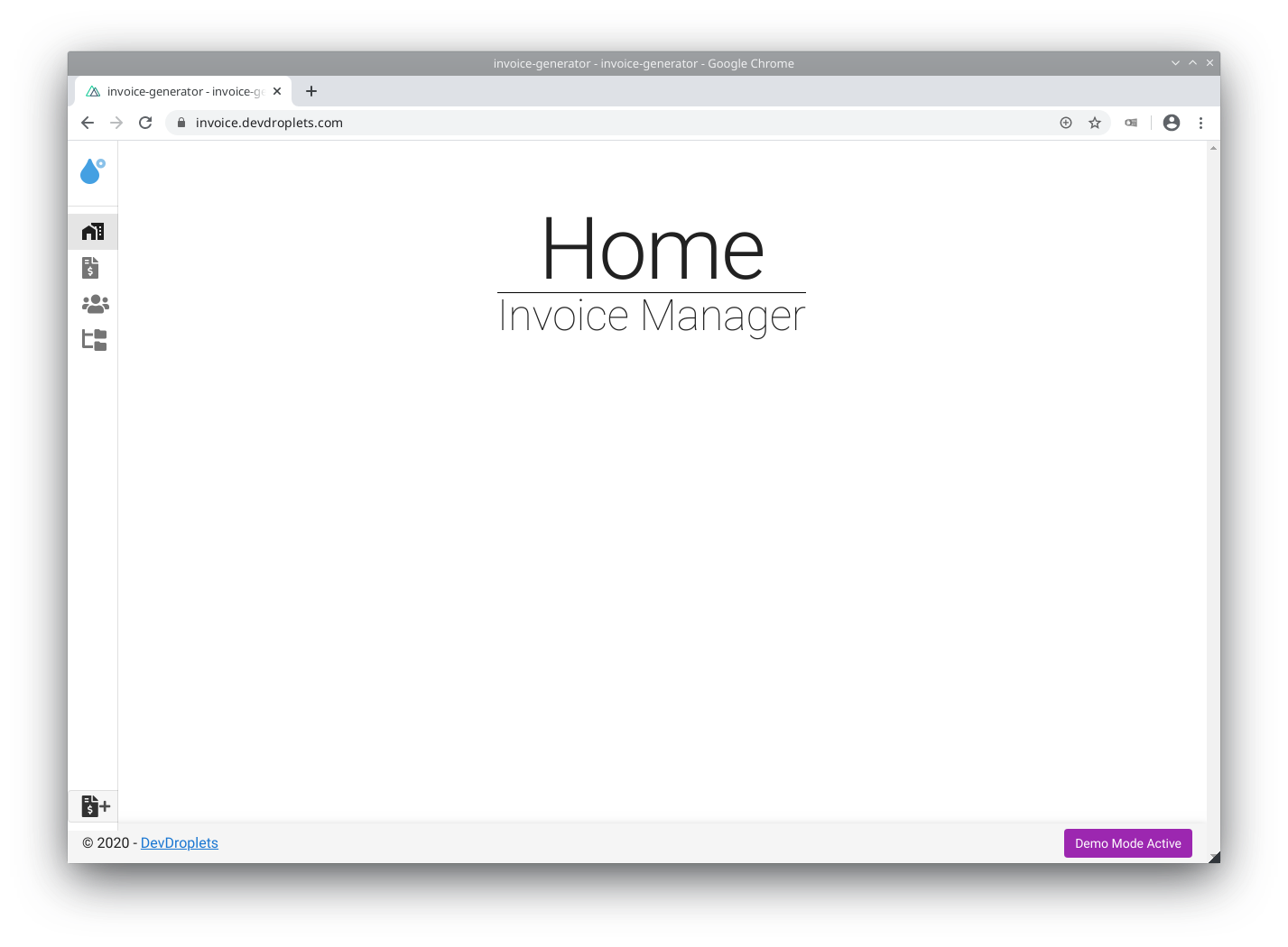
Now for our biggest feature. From the most obvious, we added a sidebar and footer. But this is only a little flair to the navigational systems we already had. A homepage with a nice title perhaps? That would be too easy, no. If you haven't noticed it yet, it is inside my normal browser! Yes, now everyone can manage the invoices anywhere with just the internet and a browser.
We have moved from having an external downloadable application to a set it up inside the browser. Everyone can access the app at invoice.devdroplets.com. Allowing everyone with an internet connection to use our invoice manager.
The reason for moving it to the world wide web was mostly for the accessibility and usability. But through this migration, we were able to refactor big chunks of our code. This way users can access the application simply by navigating to the website and we have much nicer code to look at. A win-win situation.
There are no trade-offs either. No features were hurt in the making of this webapp and the security did not lessen either. You still need your credentials, and everything is client-sided. The exception to this rule, however, is for generating PDFs and the required storage provider.
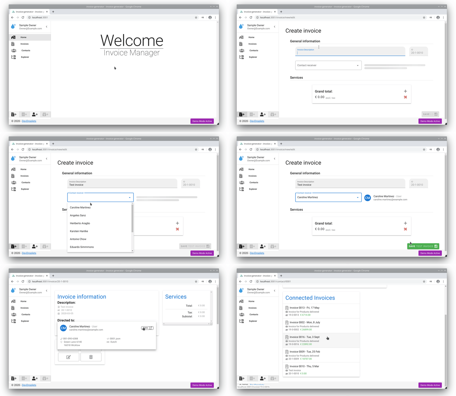
Another big addition to the Invoice-manager is the use of Contacts. Before, you had to fill in the contact's information manually, for every invoice you wanted to make. This is not the case anymore. Simply create your contact, client, company or user, and the information will be automatically added to the invoice once selected!

As you can see, Carolina Martinez was easily added to our invoice. This way, we know for certain that all the invoices sent to Carolina are with the same information. Shipping with the Contacts feature, which you saw directly after creating the invoice, was the contacts page:

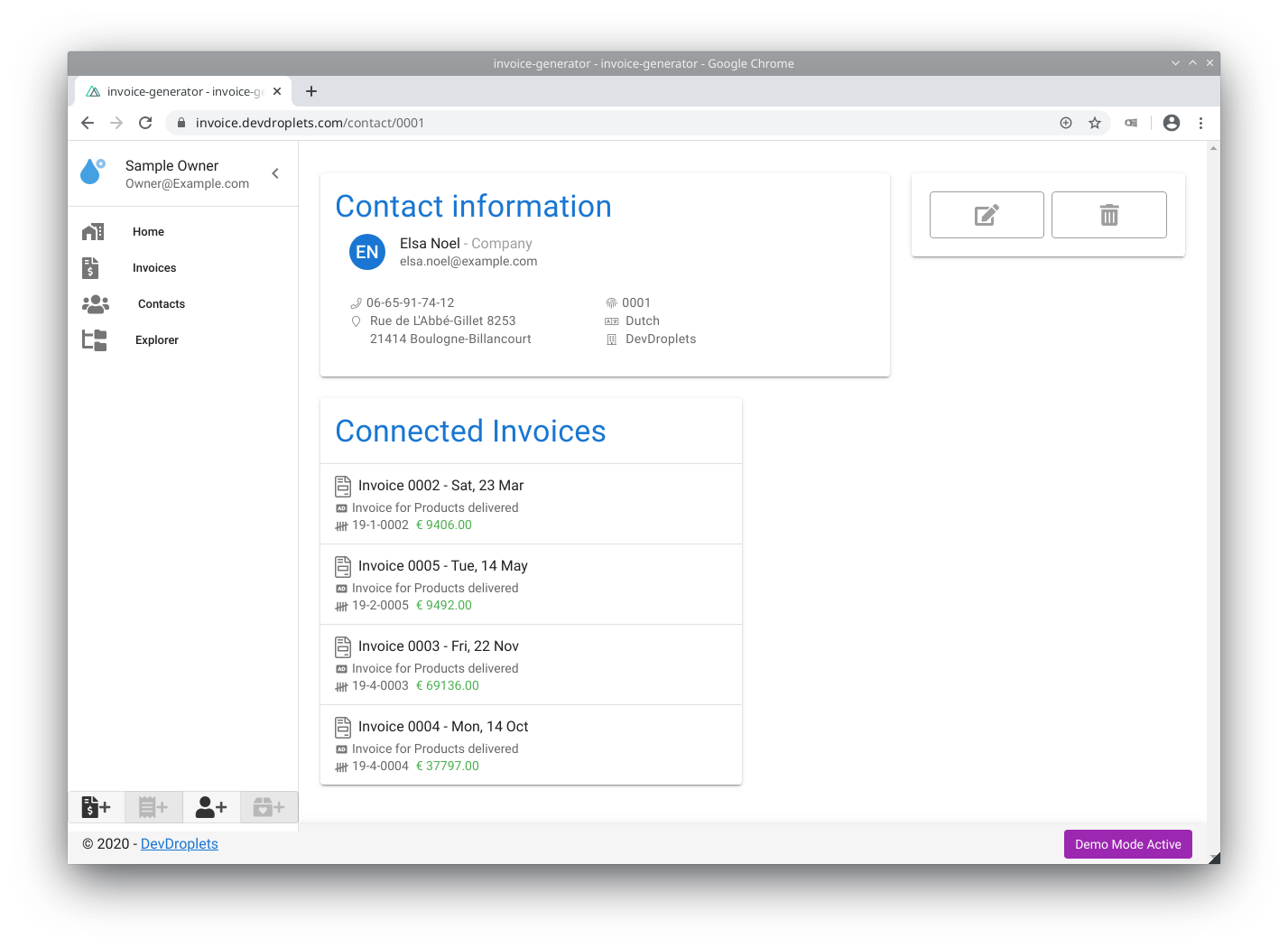
In here you can find everything connected to Mrs Noel. Her full name, contact type, phone and so on. Even what language she prefers us to use when spoken to. This is handy for a single point of user management and easy view into what users you have at the moment. To even finer the page, we added all the invoices that have been made for Mrs Noel.
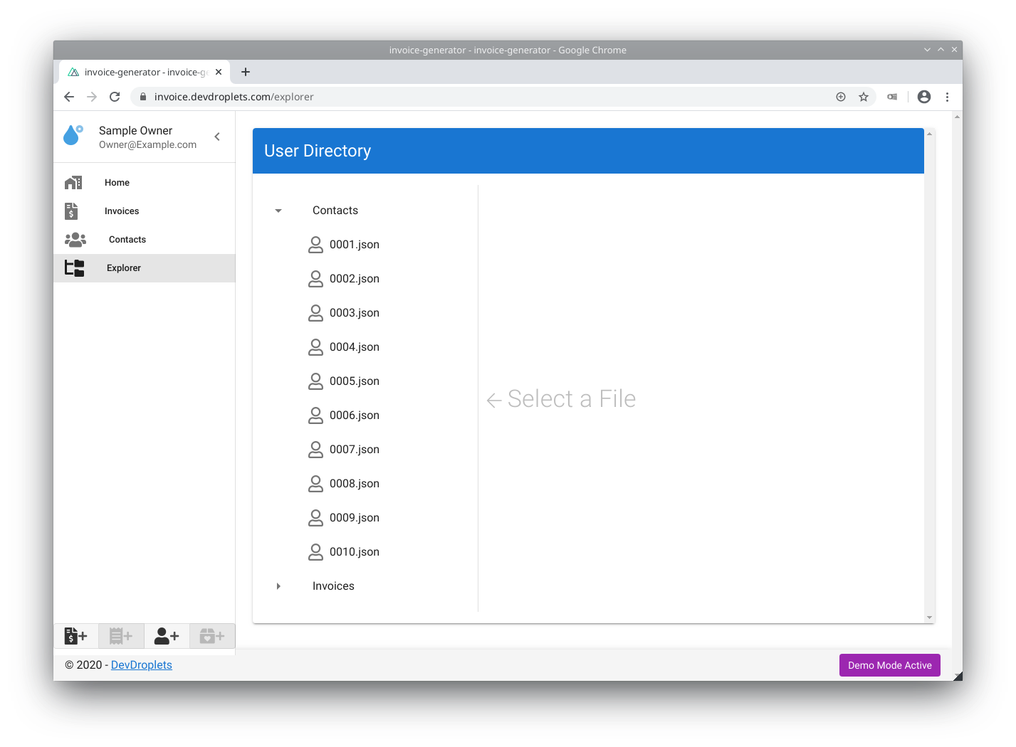
We added a couple of small neat features too, for good measure. Such as the explorer (on which we will expand more soon), a simple quick add button slot inside the side navigator:

You may have also noticed that some pages have changed. Most noticeable is the invoice creation page. It is no longer a stepper and has been changed to a full-on overview of the invoice information. As said before, we added a footer and side navigator too.
But have you noticed the purple Demo Mode Active? Hard to miss right? Good, because that was kind of the point of this article; to let you know we have a (simple) demo mode active, and you can try it yourself right now! Just go to the Invoice Managers website, and press the Demo button. It will generate a fully random playground for you to press buttons on. Hopefully, give you more insight, and maybe even more commendable, encourage you to use our platform.
If you have any questions about our product or want to make an inquiry for usage, please do not hesitate to contact us. We are also open for any suggestion you might have, but for now: Happy invoicing!

